BODEKULL GOSPEL
& JAZZ ORCHESTRA
A band that lives up to their name. It's an enhanced big band that play gospel music. I was a fan before I joined the band. The last decade I've been part of the clarinet section, tooting the bass clarinet. No other band makes me as happy. When they approach me for making their logo I was honoured.
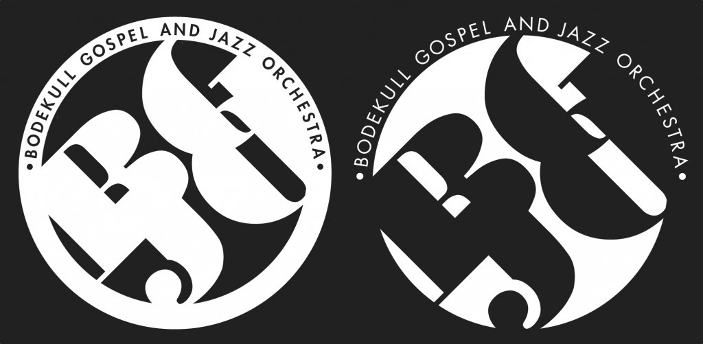
Logo design
The band requested for the logo to be round. Probably so you could potentially put it on a bass drum? A lot of sketches where made, most hand drawn, with a lot of hours put into them. But the band found a little gem in the corner, made in 5 minutes, with not much thought. This was the winner! Through the years I've grown to love its simplicity. Hope to see it on a cap one day.
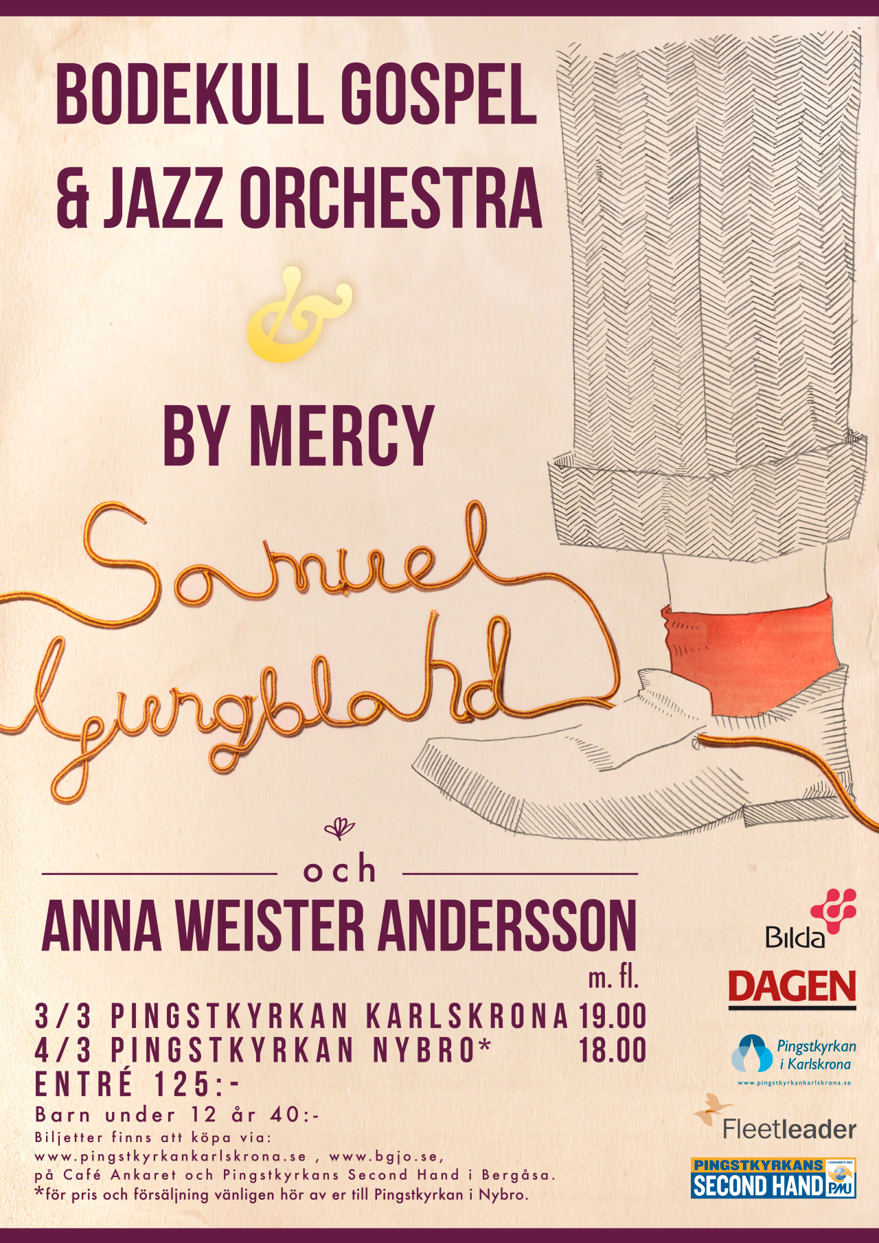
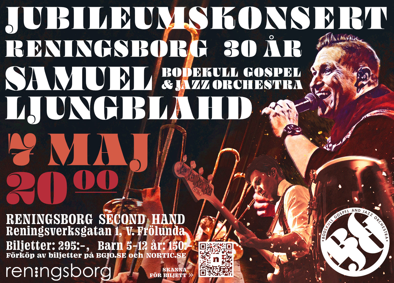
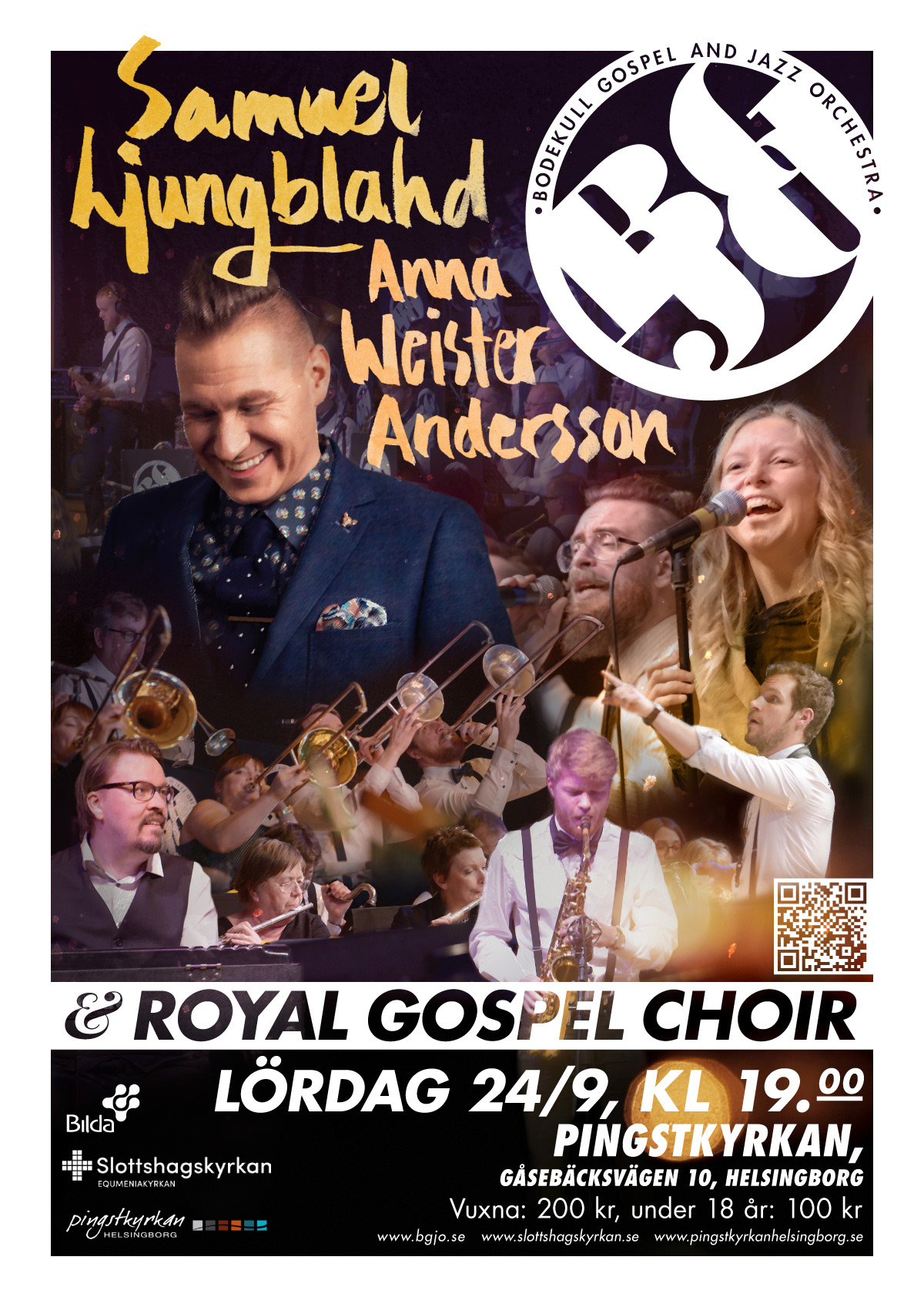
Poster design
The show is very energetic and I wanted the poster to express the same feel. At the same time I was designing a Drew Struzan-inspired film poster. The energy was a perfect match. Typography was handmade and bold. With the warning that most posters where to be printed by the arrangers themselves, I incorporated a white border into the design.
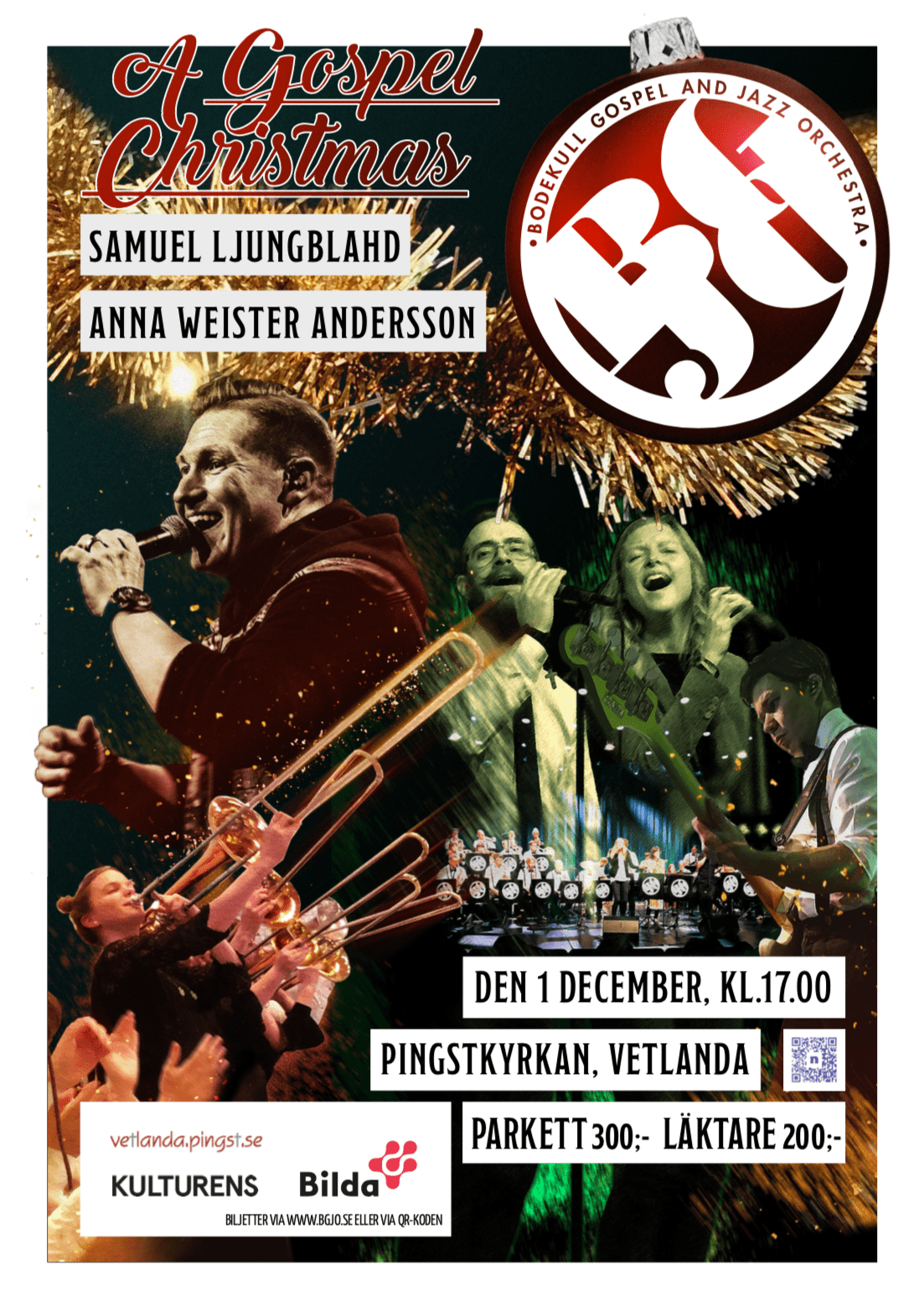
Brand development
Now that the feel and tone was found, we were ready for the next step. Next project was a Christmas tour. Since typography often needed to be adjusted between concert I settled for a more tone downed look.
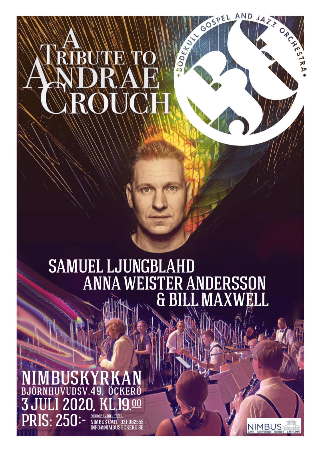
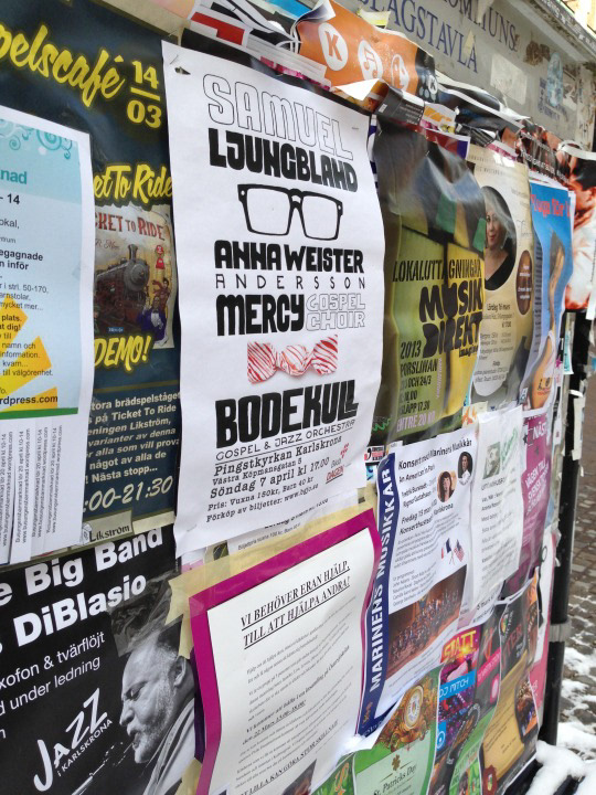
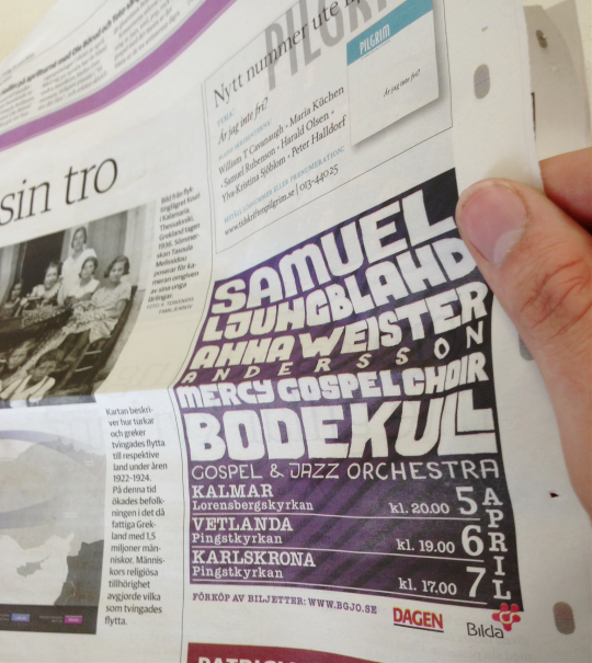
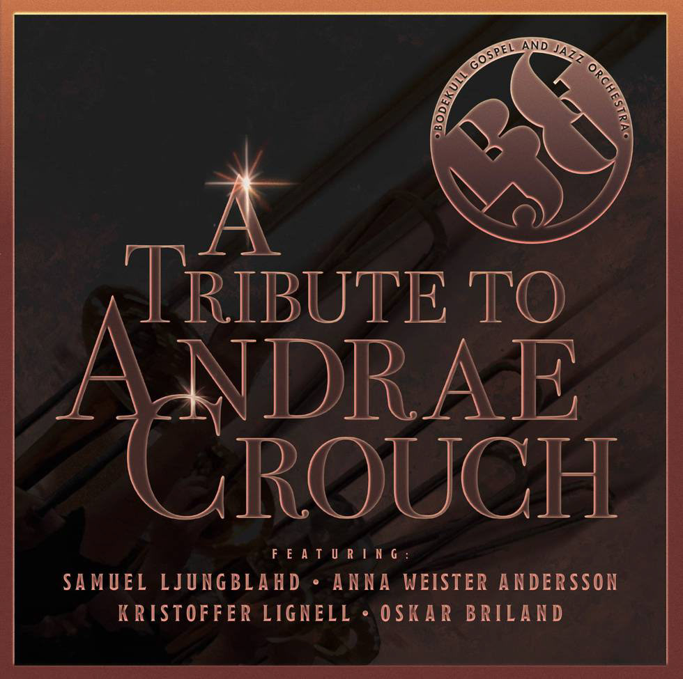
Archive designs
This design is inspired by Toulose-Lautrec, and his way of working. How he made an icon of the Moulin Rouge-dancer Jane Avril, her black gloves and yellow dress. Some posters often only used these two features.
The first time I heard Samuel was in the popular swedish television show "Så ska det låta" (same format as Irish show: the Lyrics Board). When Samuel returns to his seat after a bar-raising performance, the cameraman captures an iconic image of Samuel's shoes. From that picture came the idea that formed this poster.